Do you know about Pantone, the color guide used in various industries, primarily printing? I’ve been wild for Pantone’s “fan decks” since discovering one on the art director’s desk when I first started working at Guideposts years ago. So many shades of color, all coded and every one expertly named. Super Lemon, Firecracker, Scuba Blue, Gatsby Glitter. Can’t you just see them?
The Pantone color of the year 2015 was Marsala, an earthy rich-red wine color that is much requested at nail salons all over the country. You saw it on everyone’s mani/pedi last summer. My sister Jaime loved it, but it seemed too dark for me.
I’m more excited about the colors Pantone announced for 2016: Rose Quartz and Serenity. For the first time ever, Pantone chose two colors, colors that “demonstrate an inherent balance between a warmer embracing rose tone and the cooler tranquil blue,” according to the executive director of Pantone Institute, “reflecting a soothing sense of order and peace.”
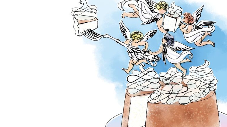
What could be more heavenly? It’s easy to imagine angels dressed in heavy Rose Quartz dusty pink robes, or wearing diaphanous baby blue Serenity gowns, or flying through clouds tinted by the sun to these hues. Can’t you just see it? Thank you, Pantone, for choosing angelic colors for 2016.


